Listen here
Podcast Show Notes
Whether you are in the beginning stages of promoting your personal brand or you’re in the midst of a new business start-up or you have been dragging your feet on a re-brand – Inside this article, I share the 4 places to find inspiration for your brand colors.
Why do you need brand colors?
Choosing an original set of brand colors is an important step when creating an identity for your brand.
As I mentioned in Episode #3 your brand identity is the tangible visible design language that appeals to the senses of your clients. This includes your brand colors used on your logo, website, photo presets, advertising, stationery, and any in-person component from events to uniforms.
“Research from Color Communications Innovations reveals people make a subconscious judgment about a person, environment, or product within 90 seconds of initial viewing and that between 62% and 90% of that assessment is based on color alone.”
So yes color is a big deal…
EP 3: 6 REASONS WHY PERSONAL BRANDING IS A NON-NEGOTIABLE
First Impressions count
You’ve heard it said that first impressions count and this is especially true when it comes to your brand.
If you really think about it – COLOR is likely the first thing a reader of your website, blog, social media feed or Pinterest profile sees.
They see your brand colors first… well if you have them defined and buttoned-down that is.
Remember, 62‐90% of a personal brand assessment is based on colors alone, so it’s important to get your brand palette right.
Knowing that colors elicit emotions and feelings I want to make sure a customer forms a correct initial about the person behind the brand.
[interact id=”5c7e954429ef1a00148154b4″ type=”quiz” mobile=”false”]
Where to look to find your brand colors
I know the power that brand colors can have on the success of a brand – so I don’t take this step in creating a brand identity lightly.
As I work with clients there are four places I have them look to find inspiration for their brand colors.
You may also enjoy reading >> HOW TO USE YOUR PERSONAL BRAND LOGOS

1. look in your closet
The first place to look is inside your closet. Yes… most likely there an underlying theme in the colors you pick up most often for your wardrobe?
Take a simple snapshot of your hanging and folded clothes that you especially wear most.
2. Look in your living room
The second place to look is in your living room. There’s usually a reason you chose that area rug, throw pillow, and armchair. Take a simple snapshot of the spaces in your home.
What is the color palette you lean most towards when decorating your home? This says a lot about who you are and the feelings that resemble you as a brand.
3. Look in your home office
The third place to look is in your home office. Since you personally decorated this space for you – there’s again a reason you chose that lamp, area rug, desk, and those folders.
Again, take a snapshot of your office space.
4. Look to your Pinterest Boards
Lastly, turn to your Pinterest Boards. Open the boards where you’ve been pinning outfit ideas, home decor spaces, and bedroom, kitchen, and living room ideas.
There’s usually a specific style you pin – take note of the common hues in these photos. These are also known as a mood board.
TIPS! Pull out the hex codes for the colors
So now that you’ve recognized these four places the next step is to pull out the specific hues to see if you find an underlying color palette theme. You’ll use a color picker tool to grab the hex code.
And a hex code is simply a six decimal code for a specific color. Once you know the hex code of a particular color you can use it anywhere from Photoshop to Canva to keep your brand identity consistent.
All my creative design elements: Social Media posts, pins, storyboards, website photos, brand elements… are done in Canva for Business. CLICK TO TRY IT! Done-for-you templates!
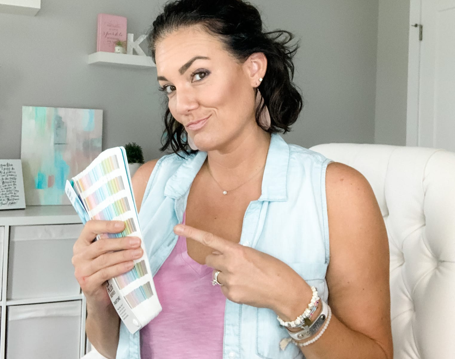
Pantone Studio Mobile Application
One way to find the hex codes and hues of your places is to use the Pantone STUDIO app. This mobile app makes it simple to take photos inside their app.
Use their color picker tool to select the common hues in your photos.
You’ll want to do this for each of your four places and record the hex code # for each hue you pull from the photos.
I have a quick demo to walk you through this option.
Color Note Application for Mac
Another way to select hex codes for your four places is by downloading the Color Note Application on your Mac or iMac. It’s a free app that sits atop your toolbar so you can easily use it.
I do most of my work from a computer so this option works best for me. I have a demo below on how to use it.
brand color palette examples
I did this exercise with Katie, a client of mine, to determine her brand palette. She sent me photos of inside her home, home office, living room, and closet. I wanted to feel how she lived and what inspired her in her day to day life.
Below you can see the hues I was able to pull out of her four places to develop her brand palette.
Then also see how she used that palette for a brand photoshoot inside her home.

Color is always first
So now you know the method I take my clients through when we dive into their brand and define their brand identity. When I’m hired to design a website, blog, or create their logo – I want to make sure that the palette represents the client and their brand but that also the colors work together in harmony.
Brand colors meaning
There is a lot of research that goes into color theory – and while I do make sure the colors I choose for a brand doesn’t pronounce an emotion that I know their brand doesn’t represent, I don’t look at the color theory first for a personal brand.

I do however make sure to note the brand adjectives of the client when choosing the brand palette. I want to make sure their personality traits are conveyed in the 5-6 colors that make up their core brand palette.
In the end: Brand Color Palette
By understanding the importance of visual language which starts with brand colors, you can define your personal brand identity and how people perceive you. You can create a consistent brand identity that connects.
If you are ready to invest in a brand identity that attracts your niche audience, looks professional, and allows you to become more recognizable I invite you to learn more about my Brand Identity Basics Course at kristinkorn.com/brandidentity
I walk you through how to choose not only a color palette for your brand, but also brand fonts, using Canva for creative design, developing your tagline, and several bonus templates for creating your own logo.
Again you can learn more about this beginner-level Brand Identity Basics Course at kristinkorn.com/brandidentity.

Although brand colors may not feel as important as content – it’s all about first impressions. Without an inviting color presence, a reader will never get to read your content if they are turned off by your brand colors.
With a consistent brand identity, you can appeal to the senses of your audience and influence their perception of your brand.
Whenever you’re ready, here are 3 ways I can help you:
- Build a Continuous Flow of New Clients Using This Simple Profit Pipeline™ – HERE!
- Turn Your Chaos Into Clarity in Just 90 Minutes with this One Call – HERE!
- Obtain the Support System You Need Inside Our Coaching Group – HERE!